
TABLE OF CONTENTS
- Overview
- Render Data
- Example: Add a Featured Documents Page
- Where the Files Go
- Override or Remove Widgets
- Publish and Caching
- Golden Rules
- Hand-Over Checklist
- Troubleshooting
Solution Architecture Guidance
- Use a custom Page Builder widget when business users need to arrange and configure reusable storefront content or commerce experiences within Page Builder. Choose the widget model based on whether the content is entered by the merchandiser, shared across shoppers, tied to a page's primary entity, or personalized and changing per request.
- Define the widget's data and caching model during solution design.
- When page caching is enabled, data loaded with the page is cached until a related publish. A publish refreshes only the pages it relates to, and publishing does not refresh data from sources outside Znode at all.
- Where an anonymous page cache or CDN is used, shoppers may see the previous version for a short period after publishing.
- Cached page data is shared by all shoppers with the same store, language, account and profile, so it must not contain shopper-specific data. Customer-specific, live pricing, cart or other frequently changing data requires a separate per-request approach. Mixing personalized data into page-cached widget content can expose one shopper's information to others.
- Treat saved Page Builder pages as a long-lived compatibility contract. Not every change to an existing widget requires a migration of saved pages:
Change Migration of saved pages Adding settings with defaults, or changing labels or layout Not required; the change is safe Renaming or removing settings, changing their type, or renaming a widget Required
Removing a widget already in use can cause existing pages to stop rendering it. To retire a widget without breaking published content, hide it from the palette; existing pages continue to render it. Requirements that change or retire existing widgets should therefore account for migration, regression testing, rollout planning and future upgrade impact. - Include these in the estimate: Page Builder and storefront behavior, theme and page-type availability, supported languages, data integration, caching and publish behavior, compatibility with existing saved pages, migration needs, multi-instance cache invalidation, testing and operational support.
- Set client expectations that Page Builder configurability does not make a data-driven widget no-code. Custom data sources, personalization, multiple themes or languages, existing-page migrations and changes to standard page widgets increase implementation effort and create an ongoing upgrade and regression-testing commitment.
A widget is one component config, used by two apps. Merchandisers arrange it in the Page Builder, the page is saved as JSON, and the storefront renders the same config for shoppers. This guide shows how the pieces connect, how to build and register a widget for your theme, and the rules that keep saved pages working after every release.
- Audience: implementation partners and developers working on the Znode 10 Page Builder.
- Stack: Puck 0.21, Next.js 15, React 19 and Nx.
- Worked Example: The example throughout is a Featured Documents widget. The example names (Featured Documents, <theme>, <project>-components) are placeholders: <theme> is the store's theme name in lowercase, and <project>-components is your customization package. Replace them with your own.
Overview
The diagram shows how a widget moves from the Page Builder, through Znode Admin and API, to the storefront.
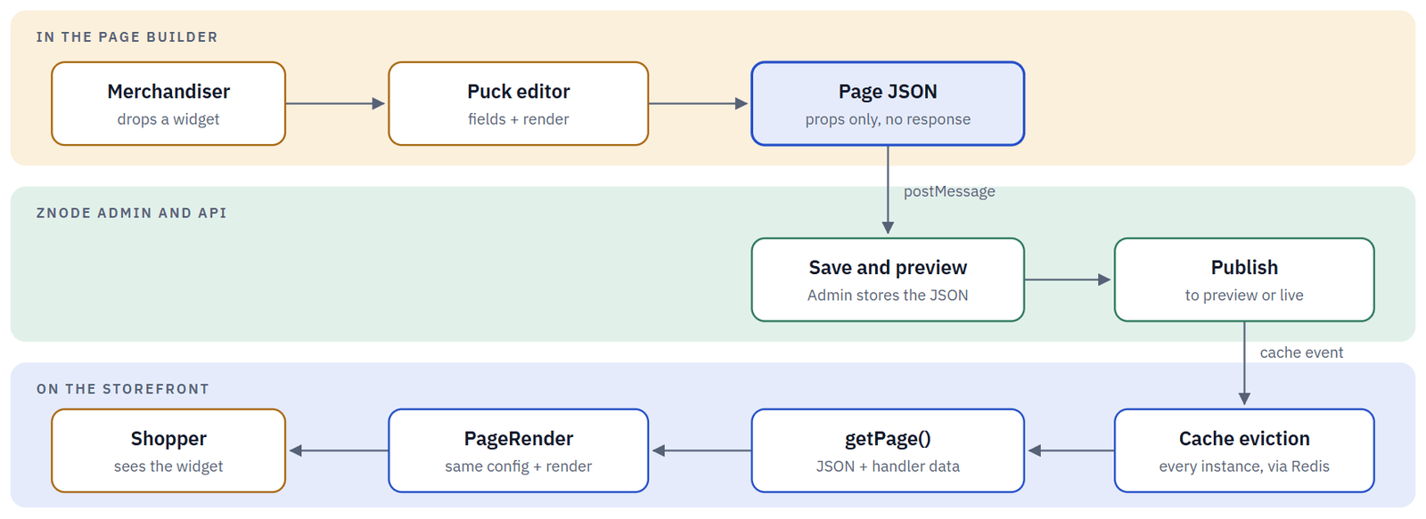
Box colors show where each step runs: people and the editor, Znode Admin and API, or the storefront server.
The editor and the storefront share one widget library, packages/page-builder. Both load pages through the same getPage() call, and the server data it attaches is never saved in the JSON.
A widget has five parts:
| Part | Where | What it does |
|---|---|---|
| Config | Both apps | Fields, defaults and the render function. |
| Render | Both apps | Turns props into a UI component. |
| Handler | Server | Loads shared data into props.response. |
| UI component | Your package | Plain React and Tailwind, no Puck. |
| Registration | Theme | Adds the widget to a palette section. |
Three Widget Families
Every widget belongs to one family. The family decides where it appears in the palette and where its data comes from. Folders are under packages/page-builder/src/configs/base-config/widgets/.
| Family | Folder | What it contains |
|---|---|---|
| UI widgets | UI-WIDGETS | Layout and content: Container, Column, Text, Heading, Button Group, Rich Text. Everything is entered in editor fields and stored in the page JSON. |
| Znode widgets | ZNODE-WIDGETS | Bound to commerce data: Banner Slider, Products Carousel, Offer Banner, Link Panel, Content Block. A server handler fills them, and configurable ones have a settings icon. Most custom widgets belong here. |
| Page widgets | PAGE-WIDGETS | One locked widget per page type that renders the page's main feature: product list, product details, cart, checkout, login. Registered per page type. |
Anatomy of a Widget
Each widget is a folder with two files: <Name>Config.tsx and <Name>Render.tsx. The config tells Puck what to show in the editor and what to save. The render component turns the saved props into the UI. The diagram shows the parts of the Featured Documents config and where each one goes.
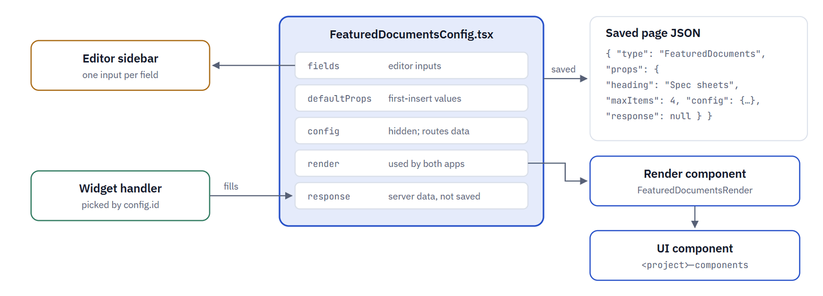
Border colors mark what is editor only, what is server data and what renders in both apps.
The hidden config prop names the handler (config.id). The handler's result arrives as response, which is cleared before every save. Use the base Heading widget (fields only) and Offer Banner widget (server data) as references.
Editor vs Storefront
The same render function runs in the editor canvas, in the editor's header and footer preview, and on the storefront. Write it so that it is correct in all three.
| Where | puck.isEditing | Puck context | What to do |
|---|---|---|---|
| Editor canvas | true | Available | DataStateHandler shows a placeholder while there is no data |
| Editor header and footer | false | Available | Use useIsEditing(props.puck) to detect the Page Builder |
| Storefront | false | Not available | Return null when there is no data; never call usePuck() |
Do treat render functions as client code. Get server data through props.response or through an API route, and read new props with a default: props.maxItems ?? 4.
Don't call agents, secrets or back-end URLs from a render function, and don't assume saved widgets have props you added later. Defaults apply only when a widget is first inserted.
How Themes Resolve
The store's theme name and the page type pick the widget set. A theme without its own folder uses the base set, so you add a theme folder only when the theme adds, overrides or removes widgets. The diagram shows how the widget set is resolved.
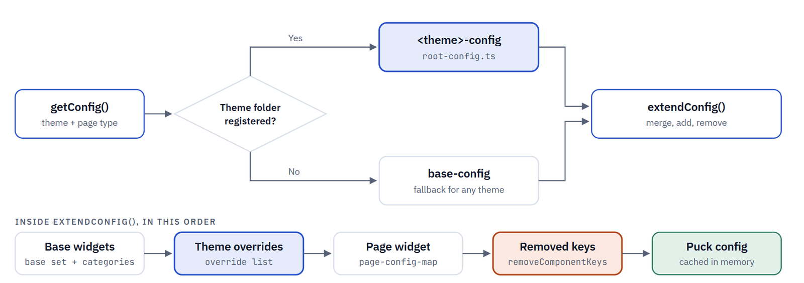
Later steps win: a page widget replaces a theme override with the same key, and removed keys are deleted last. Header and footer follow the same pattern through get-layout-config.ts and page-config-layout-map.ts.
| Page type (configType) | Page widget | Used for |
|---|---|---|
| common | None | Home page, content pages, content blocks |
| category, product | ProductListPage, ProductDetailsPage | Catalog pages |
| cart, checkout | CartPage, CheckoutPage | Cart and checkout |
| quick-order, track-order, login, … | Matching page widget | Behind feature switches in the Page Builder |
| header, footer | Header, Footer | Layout editing |
Render Data
Pick the data path by asking two questions: who is the data for, and what makes it change?
| Data | Path | Cached with the page? |
|---|---|---|
| Typed by the merchandiser | Editor fields, stored in the JSON | Yes |
| Same for every shopper, refreshed by a Znode publish | Widget handler in prepared-content-item.ts, keyed by config.id | Yes, until the next publish |
| Per shopper, or changes without a publish | Client fetch from an API route that exists in both apps | No |
| The page's main entity (product, category) | Page handler, keyed by config.id | Depends on the page |
| Per request on a page widget (cart, live prices) | preparePageData() | No |
Two details: a handler is skipped when config.widgetConfig.widgetKey is empty, so give your widget a key. Read the store from storeId, because portalId holds the content page id on content pages.
Example: Add a Featured Documents Page
Build from the data towards the editor. You can then test each piece before the next one depends on it. The example is a Featured Documents widget that lists downloadable files for the store.
Step 1 - Connect to the data: types, client, agent
packages/types/src/featured-documents.ts
packages/clients/src/znode-client/custom/
packages/agents/src/featured-documents/
Build these exactly as for a custom page. The agent takes the handler parameters, adds nothing user-specific, and returns null instead of throwing.
packages/agents/src/featured-documents/featured-documents.ts
export async function getFeaturedDocuments(params: { storeId: number; localeId: number }) {
  try {
    const response = await FeaturedDocument_list(params.storeId, params.localeId);
    return { documents: convertCamelCase(response)?.documents ?? [] };
  } catch (error) {
    logServer.error(AREA.FEATURED_DOCUMENTS, errorStack(error)); // log, never break the page
    return null;
  }
}
Step 2 - Build the UI component
packages/<project>-components/src/components/featured-documents/FeaturedDocuments.tsx
A plain "use client" React component with Tailwind classes and useTranslations. It knows nothing about Puck, so you can reuse and test it on its own.
Step 3 - Write the widget config
packages/page-builder/src/configs/<theme>-config/widgets/znode-widgets/featured-documents/FeaturedDocumentsConfig.tsx
FeaturedDocumentsConfig.tsx (excerpt)
export const FeaturedDocumentsConfig: ComponentConfig<{ props: IFeaturedDocumentsConfig }> = {
  label: "Featured Documents",
  fields: {
    heading: { type: "text", label: "Heading" },
    maxItems: { type: "number", label: "Max Documents", min: 1, max: 12 },
    response: { type: "custom", render: () => <></> },  // filled on the server
    config: { type: "custom", render: () => <></> },    // hidden routing info
  },
  defaultProps: {
    heading: "Featured Documents",
    maxItems: 4,
    response: null,
    config: {
      type: "Widget",
      id: "FeaturedDocumentsWidget",               // handler key
      hasConfigurable: false,                      // no settings icon
      widgetConfig: { widgetKey: "FeaturedDocuments", widgetCode: "FeaturedDocuments", displayName: "Featured Documents" },
    },
  },
  render: (props) => (
    <DataStateHandler response={props.response?.data?.documents ?? []} translationKey="featuredDocumentsInitialMessage">
      <FeaturedDocumentsRender {...props} />
    </DataStateHandler>
  ),
};
Step 4 - Write the render component
.../featured-documents/FeaturedDocumentsRender.tsx
FeaturedDocumentsRender.tsx
export function FeaturedDocumentsRender(props: Readonly<IFeaturedDocumentsRenderProps>) {
  const documents = props.response?.data?.documents ?? [];
  if (documents.length === 0) return null;                 // storefront: show nothing
  return <FeaturedDocuments heading={props.heading} documents={documents.slice(0, props.maxItems ?? 4)} />;
}
Need per-language text that merchandisers type? Follow the base Heading widget: a locale prop, resolveData with getUpdatedProps(), and a locale handler in configs/utils.ts.
Step 5 - Register it for your theme
<theme>-config/config/override-component-list.ts   ·   <theme>-config/config/root-config.ts
override-component-list.ts
export const addOrOverrideComponents: IComponents = {
  FeaturedDocuments: FeaturedDocumentsConfig,
};
export const addComponentsToCategories = [{ categoryKey: "znodeWidgets", componentKeys: ["FeaturedDocuments"] }];
In the theme's root-config.ts, import this list instead of the base one, and append addComponentsToCategories to addComponentToCategories. A brand-new theme folder must also be added to themeConfigMap in get-config.ts and to the map in get-layout-config.ts.
Do pick a palette section on purpose. Pages are limited to 35 UI widgets and 10 Znode widgets, and a widget in no section appears under "Other".
Don't add custom widgets to base-config. Keep them in the theme folder so Znode upgrades merge cleanly.
Step 6 - Register the data handler
packages/page-builder/src/utils/prepared-content-item.ts
prepared-content-item.ts
const widgetHandlers: IWidgetHandlersMap = new Map<string, IWidgetHandler>([
  // ...existing handlers
  ["FeaturedDocumentsWidget", async (params) => await getFeaturedDocuments(params)], // CUSTOM: Featured Documents
]);
One registration serves both apps, because both load pages with getPage(). For per-shopper data, skip the handler. Instead, call an API route from the component and add that route, or a mock in mock-routes-map.ts, to the Page Builder app as well.
Step 7 - Add translations
# In this example assuming you have US English and French languages.
apps/page-builder/messages/en-US.json
apps/page-builder/messages/fr-FR.json
apps/webstore/messages/en-US.json
apps/webstore/messages/fr-FR.json
apps/page-builder/messages/en-US.json
"VisualEditor": {
  // ...existing keys
  "featuredDocumentsInitialMessage": "No documents to show yet. Check the document feed for this store."
},
"FeaturedDocuments": { "download": "Download" }
The editor placeholder goes in VisualEditor, in the Page Builder app only. Your component's own text goes in its own namespace, in both apps and every language. Add that namespace to the localeMessages list of each route that renders page JSON.
Step 8 - Try it end to end
Run npx nx dev page-builder and npx nx dev webstore. Open a content page from Znode Admin and drop the widget from the Znode Widgets section. Check the placeholder and the data, then save, preview and publish. Finally, check the storefront page in every language.
Where the Files Go
The map shows where each file of the example goes and the step that creates or changes it.
packages/page-builder/src/
  configs/<theme>-config/
    widgets/znode-widgets/featured-documents/
      FeaturedDocumentsConfig.tsx  [new · step 3]
      FeaturedDocumentsRender.tsx  [new · step 4]
    config/
      override-component-list.ts  [new · step 5]
      root-config.ts  [use the theme list]
  configs/get-config.ts, get-layout-config.ts  [only for a new theme]
  utils/prepared-content-item.ts  [add handler · step 6]
packages/
  types/src/
    featured-documents.ts  [new · step 1]
  clients/src/znode-client/custom/
    featured-documents/  [new · step 1]
  agents/src/featured-documents/
    featured-documents.ts, index.ts  [new · step 1]
  <project>-components/src/components/featured-documents/
    FeaturedDocuments.tsx  [new · step 2]
apps/
  page-builder/messages/*.json  [VisualEditor + namespace]
  webstore/messages/*.json  [add namespace]
Override or Remove Widgets
To change an existing widget for one theme, register a widget with the same key in that theme's config. Saved pages then render your version without any change to their JSON. This repository's theme folder overrides the cart, checkout, product details and header widgets this way.
| You want to | Change |
|---|---|
| Override a UI or Znode widget | <theme>-config/config/override-component-list.ts |
| Override a page widget (cart, product details, …) | The matching entry in <theme>-config/config/page-config-map.ts |
| Override the header or footer | <theme>-config/config/page-config-layout-map.ts |
| Remove a widget from one page type | removeComponentKeys on that page type's entry |
| Stop new copies but keep existing ones | An override with permissions: { insert: false } |
| Lock a page type behind a switch | An entry in disabled-page-widgets-config.tsx + disabledConfigType in the editor client |
Do keep the key, the props shape and config.id unchanged when you override. Copy the base files first so that you inherit their edge cases.
Don't remove a key from a page type that already uses it. Removal deletes it from the config, so existing copies stop rendering in the editor and on the storefront.
Publish and Caching
Saving and publishing happen in Znode Admin. The editor hands Admin the page JSON; the storefront picks up a publish through a cache event.
| Stage | How it runs | What happens |
|---|---|---|
| 1. Edit | Automatic | Each change sends the JSON to Admin with every response cleared. |
| 2. Save and preview | In Admin | Admin stores the JSON. Preview stores load the preview version. |
| 3. Publish | Automatic | A cache event reaches /api/revalidate-with-token and the store's cached page JSON is deleted. |
| 4. Every instance | Needs Redis configured | A Redis cache-eviction message clears the in-memory caches on each storefront instance. |
Important: with ENABLE_PAGE_CACHE=true, the storefront caches each page together with its handler data until the next publish. Never return shopper-specific data from a handler. Load data that changes without a publish in the browser instead.
Changing Props Safely
Saved pages outlive your code. Most changes are safe if they add something. Renames and removals need a page JSON migrator.
Change Migration? Add a prop with a default, add an option, change labels or markup No Rename or remove a prop, or change its type Yes Rename a component key or config.id Yes. Otherwise the editor shows "No configuration for …" and the storefront drops the widget
packages/page-builder/src/lib/migrations/migrators/Version2To3Migrator.ts (outline)
export class Version2To3Migrator implements IVersionMigrator {
  public sourceVersion = 2;
  public targetVersion = 3;
  public migrate(json: JsonObject): JsonObject {
    // rename FeaturedDocuments.limit to maxItems in data, headerData and footerData,
    // including widgets nested inside slots such as Container columns
    return { ...json, data: this.transform(json.data), version: this.targetVersion };
  }
}
Register the migrator in MigrationPipeline.ts, export it from migrators/index.ts and raise CURRENT_JSON_VERSION (currently 2) by one. Pages are migrated when they load, in both apps. If migration fails, the editor refuses to open the page and the storefront renders the unmigrated JSON.
Golden Rules
| Rule | What it means |
|---|---|
| One render, two apps | Every widget must work in the editor and on the storefront without Puck context. |
| The JSON holds only what was typed | Server data arrives as response and is cleared before every save. |
| Keys are a contract | Never rename a component key, a prop or config.id without a migrator. |
| Shared data only in handlers | Handler results are cached with the page and served to every shopper. |
| Every language, both apps | Add each translation namespace to all language files of both apps. |
| Custom code in custom folders | Use the theme folder and your own package. Mark baseline edits with // CUSTOM: <reason>. |
Hand-Over Checklist
Before the pull request, check that:
- The widget appears in the intended palette section, and only on the intended page types
- The editor shows the placeholder without data, and the widget once data exists
- After publishing, the storefront shows the widget in every language
- The storefront shows nothing, with no errors, when there is no data
- The saved JSON contains no response data and no shopper-specific values
- A second publish refreshes the widget's data on every storefront instance
- Pages saved before your change still open in the editor and render on the storefront
- Unit tests cover the agent, the render component and any migrator; lint passes (npm run lint)
- Edits to baseline files are marked with // CUSTOM:
Troubleshooting
| You see | What it usually means |
|---|---|
| The widget is missing from the palette | The store uses another theme, the key is not in the theme config, or the page type removes it |
| The widget is listed under "Other" | The key was added to the components but not to a category |
| "No configuration for …" in the editor | Saved JSON uses a key that the current config does not register |
| response is always empty | config.id does not match a handler, widgetKey is empty, or the agent failed (check the server logs) |
| Old data after the source changed | The page cache holds handler data until the next publish |
| Messages for <Namespace> not found. | A namespace is missing from one language file in one of the apps |
| "This page is not compatible with the current app version" | A migrator is missing or failed. Check the page JSON migration logs |