
TABLE OF CONTENTS
- Overview
- Server and Client Components
- Example - Status Badge
- Create a Component Library
- Component to Page Builder Widget
- Golden Rules
- Hand-Over Checklist
- Troubleshooting
Solution Architecture Guidance
- Use reusable storefront components when the same experience or presentation pattern needs to appear across multiple pages, features, or Page Builder widgets. Reuse is most valuable when the experience can remain independent of a specific feature's business rules or data requirements.
- Move a component to a shared location once a second feature needs it, rather than designing for reuse up front.
- Define the intended scope of reuse during solution design. Every shared component must support store themes, languages, accessibility, and responsive layouts, and the Znode building blocks already provide most of this support. The estimate grows mainly when a component must also:
- Work as a Page Builder widget.
- Render on both server and browser.
- Serve several stores or features.
- Avoid designing a shared component around the requirements of one specific feature and then treating it as broadly reusable. Feature-specific rules and data requirements can create coupling that makes the component harder and more costly to use or change across other experiences.
- Treat broadly reused components as long-lived solution assets rather than one-time project work. The more experiences that depend on a shared component, the wider the impact of future changes, so its testing, ongoing maintenance, and the effect of future Znode upgrades should be included in the estimate.
Overview
A reusable component gets its data, text and colors from outside, so the same piece works on a list, a detail page and a Page Builder widget. This guide shows where components belong, how to build one, and the rules that keep them theme-aware, translatable and upgrade-safe.
- Audience: Implementation partners and developers
- Stack: Next.js 15, React 19, Tailwind, Nx
- Example: A StatusBadge used in two places
Example names (StatusBadge, RecordTable, Warranty Claims, <project>-components) are placeholders. Replace them with your own.
Components sit in three layers. Each layer uses only the layer below it. A building block never knows which feature or page renders it, which is what makes it reusable.
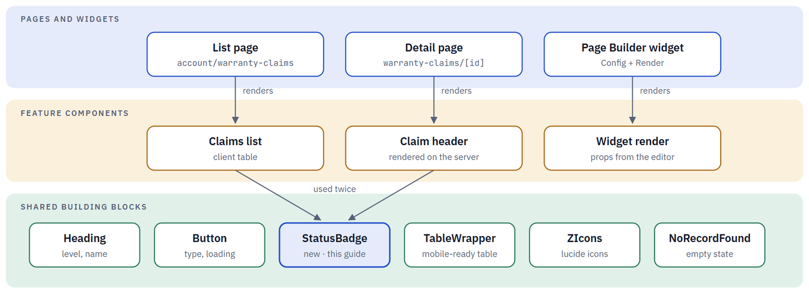
| Layer | Name | What it does |
|---|---|---|
| Layer 1 | Page or widget | Loads data and translations, then renders features. |
| Layer 2 | Feature component | One screen or section. Knows its data and its text. |
| Layer 3 | Building block | Small and generic. Everything comes in through props. |
Where Should the Component Live?
Answer three questions. Start small: a component moves to a shared folder the second time it is needed, not the first.
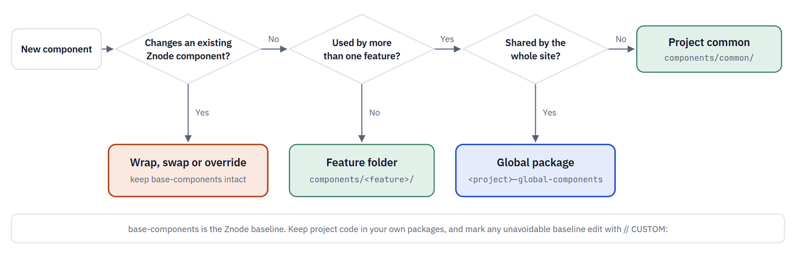
Folders shown are inside packages/<project>-components/src/. Use a global package only if your project already keeps one for site-wide pieces such as header and product-card badges.
| When the component is used by | Put it in | Notes |
|---|---|---|
| One feature | Feature folder | components/warranty-claim/, next to the screens that use it. The default for anything new. |
| Several features | Project common folder | components/common/status-badge/. Generic, prop-driven, tested. |
| A change to Znode UI | Wrap, swap or override | Compose, use a slot or swap the import at the route. See Changing an Existing Znode Component. |
The Shared Building Blocks
Before writing new markup, check packages/base-components/src/components/common/. These blocks already follow the store theme, carry test selectors and handle mobile layouts.
| Block | Import from | Good to know |
|---|---|---|
| Heading | @znode/base-components/common/heading | level h1–h6 (default h2), name or children, customClass |
| Button | @znode/base-components/common/button/Button | Default export. type, loading, ariaLabel; dataTestSelector is required |
| TableWrapper | @znode/base-components/common/table/TableWrapper | Default export. Columns add heading and displayOnMobile; needs the Common namespace |
| DynamicPagination | @znode/base-components/common/pagination | Keeps pageNumber and pageSize in the URL; needs Pagination |
| NoRecordFound | @znode/base-components/common/no-record-found | Empty-state text with size and align |
| ZIcons, LoadingSpinnerComponent | @znode/base-components/common/icons | Any lucide icon by kebab-case name; full-width spinner |
| Modal, Tooltip | @znode/base-components/common/modal, …/tooltip | Modal traps focus and closes on Escape |
| FormatPriceWithCurrencyCode | @znode/base-components/common/format-price | Formats a price in the given currency |
Import tip: folder index files re-export named exports only. Components with only a default export, such as Button and TableWrapper, are imported from their file path. Give your own components named exports.
Server and Client Components
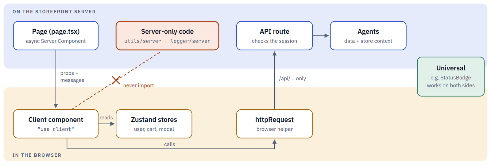
Files are Server Components unless they start with "use client". A component with no hooks and no server calls is universal: it renders on either side unchanged. Make building blocks universal whenever you can.
Pages pass serializable props and translation messages down. Browser code reaches data only through the storefront's own /api/ routes.
| Kind | Starts with | Can use | Examples |
|---|---|---|---|
| Server component | nothing, often async | Agents, getTranslations, @znode/utils/server | JsonLd, every page.tsx |
| Client component | "use client" | Hooks, useTranslations, stores, httpRequest, events | TableWrapper, Modal, Tooltip |
| Universal component | nothing, no hooks | Props only | Heading, Separator, NoRecordFound |
Do put "use client" as low in the tree as possible, log from the browser with logClient from @znode/logger, and add import "server-only"; to modules that must stay on the server.
Don't import @znode/utils/server, @znode/logger/server, agents or clients into a client file, or pass functions such as onClick from a server component.
Example - Status Badge
The example is a StatusBadge that shows a colored status label. It is used in a client list and on a server-rendered detail page, then extended into a table with an empty state.
Step 1 - Create the folder
packages/<project>-components/src/components/common/status-badge/
One component family per folder. Folder names are kebab-case; the file is named after the component.
Step 2 - Write the component: props in, markup out
No fetching, no stores and no text of its own. Colors come from theme tokens, so every store's theme applies automatically.
StatusBadge.tsx
import type { ReactNode } from "react";
export type StatusTone = "success" | "error" | "info" | "neutral";
export interface IStatusBadgeProps {
  label: string;                 // already translated by the caller
  tone?: StatusTone;             // meaning, not colour
  icon?: ReactNode;              // optional slot
  size?: "small" | "default";
  customClass?: string;
  dataTestSelector?: string;
}
// Full class names only: Tailwind finds classes by scanning the source.
const TONE_CLASSES: Record<StatusTone, string> = {
  success: "text-successColor border-successColor",
  error: "text-errorColor border-errorColor",
  info: "text-linkColor border-linkColor",
  neutral: "text-textColor border-cardBorderColor",
};
const SIZE_CLASSES = { small: "text-xs px-2 py-0.5", default: "text-sm px-3 py-1" };
export function StatusBadge({ label, tone = "neutral", icon, size = "default", customClass = "", dataTestSelector }: Readonly<IStatusBadgeProps>) {
  return (
    <span
      className={`inline-flex items-center gap-1 rounded-full border font-semibold ${TONE_CLASSES[tone]} ${SIZE_CLASSES[size]} ${customClass}`}
      data-test-selector={dataTestSelector}
    >
      {icon && <span aria-hidden="true">{icon}</span>}
      {label}
    </span>
  );
}
Do keep it universal (no "use client", no hooks) so it renders in server and client components alike.
Don't build class names from strings such as `text-${tone}Color`. Tailwind never generates them.
Step 3 - Keep business rules with the feature
Which status counts as "success" is a feature decision. Put the mapping next to the feature, not inside the badge.
components/warranty-claim/claim-status.ts
const CLAIM_STATUS_TONE: Record<string, StatusTone> = {
  Approved: "success",
  Rejected: "error",
  Submitted: "info",
};
export const getClaimStatusTone = (status: string): StatusTone =>
  CLAIM_STATUS_TONE[status] ?? "neutral";
Step 4 - Add the translations
apps/webstore/messages/en-US.json   ·   apps/webstore/messages/fr-FR.json
messages/en-US.json
"WarrantyClaims": {
  "status": "Status",
  "statusLabels": { "Approved": "Approved", "Rejected": "Rejected", "Submitted": "Submitted" }
}
Add the keys to every language file. If the component also appears in a Page Builder widget, add them to apps/page-builder/messages/ as well.
Step 5 - Use it in place 1: a client list
WarrantyClaims.tsx (excerpt)
"use client";
const t = useTranslations("WarrantyClaims");
const columns = [
  {
    title: t("status"), heading: t("status"),
    dataIndex: "status", key: "status", displayOnMobile: true,
    render: (status: string) => (
      <StatusBadge label={t(`statusLabels.${status}`)} tone={getClaimStatusTone(status)} size="small" />
    ),
  },
];
return <TableWrapper columns={columns} data={claims} loading={loading} expandedRowByKey="claimId" />;
Step 6 - Use it in place 2: a server page
The detail page reads its text on the server with getTranslations. The badge adds no browser JavaScript.
app/[locale]/account/warranty-claims/[id]/page.tsx (excerpt)
import { getTranslations } from "next-intl/server";
import { StatusBadge } from "@znode/<project>-components/components/common/status-badge";
const t = await getTranslations("WarrantyClaims");
return (
  <div className="flex flex-wrap items-center gap-3">
    <Heading name={claim.claimNumber} level="h1" />
    <StatusBadge
      label={t(`statusLabels.${claim.status}`)}
      tone={getClaimStatusTone(claim.status)}
      icon={<ZIcons name="shield-check" size={14} />}
    />
  </div>
);
Step 7 - Make it configurable: compose a RecordTable
Combine shared blocks into a slightly bigger piece: a table with an empty state and an optional action slot.
components/common/record-table/RecordTable.tsx
"use client";
export function RecordTable({ columns, rows, rowKey, loading, emptyText, emptyAction }: Readonly<IRecordTableProps>) {
  if (!loading && rows.length === 0) {
    return (
      <div className="grid justify-items-center gap-3">
        <NoRecordFound text={emptyText} />
        {emptyAction}                      // slot: e.g. a "Create" button
      </div>
    );
  }
  return <TableWrapper columns={columns} data={rows} loading={loading} expandedRowByKey={rowKey} />;
}| Technique | Use it for | Example |
|---|---|---|
| Typed props with defaults | Variations you can name | tone, size, level |
| Slots (ReactNode props, children) | Content the component shouldn't know about | icon, emptyAction |
| Render props | Per-row or per-item output | render on table columns |
| customClass | Spacing and layout from the caller | customClass="mt-4" |
| customComponent | Replacing a whole feature screen | See Wrapper and Custom Components |
Step 8 - Test it
Put a spec next to the file. Pure components need no mocks. Run npx nx test <project>-components; the package needs a jest.config.ts.
StatusBadge.spec.tsx
it("shows the label and the tone colour", async () => {
  const host = document.createElement("div");
  const root = createRoot(host);
  await act(async () => root.render(<StatusBadge label="Approved" tone="success" />));
  expect(host.textContent).toBe("Approved");
  expect(host.querySelector("span")?.className).toContain("text-successColor");
});
Wrapper and Custom Components
Several Znode screens are split in two: a presentational component that takes all its text as props, and a small wrapper that fills those props. The wrapper also accepts a customComponent that replaces the whole screen. The Page Builder renders the same presentational component with text from the editor.
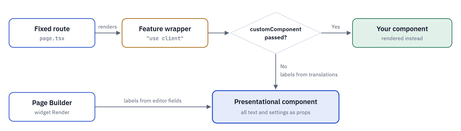
Baseline examples: QuickOrderWrapper, ForgotPasswordWrapper and OrderStatusWrapper. Their routes pass customComponent={null} as a placeholder for your own screen.
apps/webstore/src/app/[locale]/quick-order/page.tsx
// CUSTOM: project-specific quick order screen
import { ProjectQuickOrder } from "@znode/<project>-components/components/quick-order/ProjectQuickOrder";
<QuickOrderWrapper customComponent={<ProjectQuickOrder />} />
Use the same split for your own features when a screen may appear on a route and as a widget: a presentational component with every text as a prop, a small wrapper that fills them from translations, and a widget render that fills them from editor fields.
Changing an Existing Znode Component
Pick the least invasive option. The higher in the list, the easier your next Znode upgrade.
| Option | Effect on the baseline | What to do |
|---|---|---|
| 1. Compose | No baseline edit | Build around the baseline component: content before or after it, different props. |
| 2. Use a slot | No baseline edit | Pass your UI through customComponent, children or a render prop. |
| 3. Swap at the route | Route or config only | Import your component instead of the baseline one in the route's page.tsx. Widgets: addOrOverrideComponents. |
| 4. Edit in place | Review on upgrades | Last resort. Mark every changed line in base-components with // CUSTOM: <reason>. |
Copying a component? Copy it into your project package, keep its file and prop names, note the baseline file it came from, and swap it in at the route. Compare it with the new baseline on every upgrade.
Text
Building blocks take translated strings as props. Feature components read their own namespace with useTranslations (client) or getTranslations (server). A client component sees only the namespaces passed to NextIntlClientProvider, so list the namespaces of the building blocks too: TableWrapper needs Common, DynamicPagination needs Pagination.
page.tsx
const messages = await fetchMessages(["WarrantyClaims", "Common", "Pagination"]);
return (
  <NextIntlClientProvider messages={{ ...messages }}>
    <WarrantyClaims />
  </NextIntlClientProvider>
);
Theme
Each store's dynamic CSS sets variables such as --primary and --success. The root layout writes it into the page, the Page Builder loads it from /api/store-css, and the shared Tailwind preset maps the variables to tokens.
| Use this token | Driven by | Typical use |
|---|---|---|
| text-textColor | --primary | Body and heading text |
| text-linkColor, hover:text-hoverColor | --link, --hover | Links and info states |
| text-successColor, text-errorColor | --success, --error | Status and validation |
| bg-primaryBtnBgColor, bg-secondaryBtnBgColor | --primary-btn-bg, --secondary-btn-bg | Custom buttons (prefer btn-primary) |
| border-cardBorderColor, border-inputBorderColor | --card-border, --input-border | Cards and fields |
| rounded-cardBorderRadius, rounded-btnBorderRadius | --card-radius, --btn-border-radius | Corner radius |
New packages need no Tailwind change: both apps scan packages/**/src for class names.
State
Shared browser state lives in the Zustand stores exported from @znode/base-components/stores, such as useUser, useCartDetails, useModal and useToast. Feature components read them and pass values down; building blocks never read a store directly.
Do use theme tokens and existing classes (btn-primary, heading-2), and read existing stores instead of refetching user or cart data.
Don't hard-code hex colors, palette classes for brand colors, or visible text inside a component.
Accessibility
A shared component appears on many pages, so a gap in one component repeats everywhere. Check each point before you share a component.
| Check | What to do |
|---|---|
| Right element | Actions are buttons (Button defaults to type="button"), navigation is a link, data is a table. |
| Clear heading outline | Use Heading with an explicit level. One h1 per page. |
| Names for icon-only controls | Pass ariaLabel. Hide decorative icons with aria-hidden="true". |
| Color is never the only signal | StatusBadge always shows its label; the tone color is extra. |
| Visible focus | global.css draws focus outlines from --focus-outline-color. Keep them. |
| Focus stays in dialogs | Use Modal: it traps focus and closes on Escape. |
| Changes are announced | Use role="status" or aria-live="polite" for messages that appear after an action. |
| Test selectors | Add data-test-selector with a type prefix (btn, link, spn); formatTestSelector helps. |
Create a Component Library
You need to do this once per project. If your project has no customization package yet, generate one with Nx. Preview with --dry-run first. The workspace default creates libraries without tests, so ask for Jest explicitly.
npx nx g @nx/react:lib packages/<project>-components \
  --name=<project>-components \
  --importPath=@znode/<project>-components \
  --bundler=none --style=none --linter=eslint --unitTestRunner=jest \
  --dry-run
Then add deep aliases next to the root alias, so components can be imported by folder. Every alias must point to a file or folder that exists. Restart the dev server afterwards.
tsconfig.base.json → compilerOptions.paths
"@znode/<project>-components": ["packages/<project>-components/src/index.ts"],
"@znode/<project>-components/components/*": ["packages/<project>-components/src/components/*"],
"@znode/<project>-components/stores/*": ["packages/<project>-components/src/stores/*"],
packages/<project>-components/
  project.json  [projectType: library]
  tsconfig.json, tsconfig.lib.json, .eslintrc.json
  src/
    components/
      common/  [shared by several features]
      <feature>/  [one feature]
    http-request/  [browser helpers for /api routes]
    stores/  [project Zustand stores]
Component to Page Builder Widget
A component whose text and settings are all props can become a widget without changes. The widget adds a <Name>Config.tsx with the editor fields and a <Name>Render.tsx that maps those fields to your props. Widgets render in both apps, so their translations go in apps/webstore/messages and apps/page-builder/messages.
Golden Rules
| Rule | What it means |
|---|---|
| No fetching in building blocks | Data comes in as props. Pages and features fetch, through agents or /api/ routes. |
| Props over globals | Building blocks don't read stores, cookies, the URL or store settings. |
| No hard-coded text | Every visible string comes from a prop or a translation, in every language file. |
| No hard-coded colors | Theme tokens only, so each store's theme applies. |
| Server-only code stays on the server | Client files never import utils/server, logger/server, agents or clients. |
| Project code in project packages | Leave base-components as the baseline. Mark unavoidable edits with // CUSTOM:. |
Hand-Over Checklist
Before the pull request:
- The component is in the right place (feature folder, project common/ or global package), not in base-components
- It works in every place it is used, in every language (/en-US/…, /fr-FR/…)
- All text comes from props or translations, and every namespace exists in every language file
- All colors use theme tokens; changing the store theme changes the component
- No client file imports server-only modules, agents or clients
- Keyboard use works, focus is visible and icon-only controls have a name
- Interactive elements carry a data-test-selector, and a spec covers the component's logic
- Tests and lint pass (npx nx test <package>, npm run lint)
- Edits to baseline files are marked with // CUSTOM:
Troubleshooting
| You see | What it usually means |
|---|---|
| "…needs useState…" or a similar hook error | A hook is used in a file without "use client". Add the directive, or move the hook into a client child |
| "Functions cannot be passed directly to Client Components" | A server page passes onClick or another function. Move the handler into the client component |
| Build error about server-only or next/headers | A client file imports server-only code. Fetch through an /api/ route with httpRequest instead |
| Messages for <Namespace> not found. | A namespace is missing from one of the language files |
| Translation keys instead of text | The namespace, or one a building block needs, wasn't passed to NextIntlClientProvider |
| A Tailwind class has no effect | The class name is built from a template string, or the token doesn't exist |
| Import is undefined | A default-only export was imported through a folder index. Import from the file path |
| Module not found: @znode/<project>-components/… | The alias is missing or points to a file that doesn't exist. Fix tsconfig.base.json and restart |